Showing posts with label design. Show all posts

Tuesday, December 29, 2015

Cover-Off

Jordan Castillo Price is one of the first m/m authors I read, and she is part of the reason I started writing in the genre. So not surprisingly, I was a tad nervous meeting her in person at the Atlanta GRL, even though we had interacted only plenty times before. Fortunately, she was cool, and a little crazy, and we hit it off.

Jordan and I both design book covers too, and it's nice to have someone to talk shop with. It was her idea to do a design-off—both of us coming up with an original book cover using the same basic elements. These are the final result. Guess who did which one.


See the whole creative process in action on JCP's web page.

Tuesday, June 9, 2015

Beefcake


The great thing about designing your own cover is that you can go completely nuts.

I made this one years ago when I first spotted the magnificently cheese-tastic stock photo of a handsome man on the beach. The pose reminded me of classic pulp covers.


I couldn’t resist; I added a turgid sky and faux tear and wear, and had my own pulp cover. I finally have enough old summer-themed short stories—some of them out of print—for a small anthology and an excuse to reveal Mr. Beefcake to the world. Short Shorts is now live on Amazon and ARe.

Thursday, February 19, 2015

Happy Lunar New Year!

Today is the first day of the Year of the Goat. Some say sheep, but I prefer goat. Goats are awesome; check youtube if you don't believe me.

Last year mostly sucked hairy donkey balls for me, and picked up only towards the very end. But I have high hopes for this new one. Yes, I have a smidgenly [sic] superstitious tendencies. I've been doing a lot of cover designs lately, and a bunch of different genres, and they are a source both for stress and pleasure. The thing is, I need them and not just because of the money. I crave the challenge and working in a visual media, and they provide a much more immediate gratification than writing.

Writing is a slow-burn creative endeavor, with different challenges and rewards. It's nice to have a bit of both.

I woke up this morning muzzy, trying to fix in my memory the bizarrely awesome dreams I had about magical worlds, strange and scary creatures, and general and utter weirdness that exists only in dreams. The imagery they came with was so very rich and "real," part contemporary, part fantasy. I wrote down the scraps I'd managed to rescue from the sandman. I might be able to use them in a story or two one day.

Friday, April 25, 2014

Cut & Paste – Part 2


Last time I blathered on about depth of field and how it helps to make the subject of an image to stand out from the background. Today I want to bring up something else that does the same.

(Madonna of the Yarnwinder by De Vinci)

aerial perspective
noun Art
the technique of representing more distant objects as fainter and more blue.

This is a real thing, not just something painters made up to mess with our heads. Hike up to the top of a mountain, look around, and will see something like this: 


See how the mountains get fainter and less defined the farther away they are? This effect is caused by our very atmosphere scattering the light. With distance contrast and saturation decreases and everything shifts toward a single color. Not necessarily blue—it depends on the time of day.


The photo sliced from previous post's Pride and Prejudice poster was most likely shot early morning and consequently the background has a warm yellow tint. Here are some more movie posters making it work:


I often take inspiration from movie posters because a whole lot of work have gone into them, and they are designed to work both on billboards and as thumbnail size on Netflix. Sadly, I don't have their designer's budget and super-high resolution photos of places and people. I have to make do with stock photos and that's a challenge in itself.

I prefer not to create my cover models using the Frankenstein method, but sometimes it's unavoidable, especially in case historical novels.  It's hard enough to find a model wearing the right outfit, it's next to impossible to find one who also has the right look. The good thing about those old time clothes that high collars and cravats make head-swapping easier.

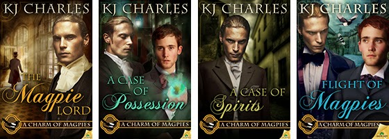
So far the cover I had to do the most work on was KJ Charles' Flight of Magpies.


Here are all the stock photos that went into it:


They also took a wee bit of manipulation. For example, the street in the middle left has the right overall look, it could even be from the Victorian era, but it's far too colorful. If I left it so it would've dominated the whole cover. So I manipulated to create the effects of both aerial perspective and depth of field. This was done with multiple layers, Gaussian blur filter, gradient mask, hue/saturation adjustment layer, and selective shading. I also added the cobblestone effect from the other photo.

I'm possibly the most pleased about the street, but putting Stephen and Lord Crane together took at least twice as long. Aside from the obvious, there was also a lot of adding shadows, darkening, lightening, adjusting colors and saturation. But in the end they came together pretty well.

This is the point where I'm supposed to wrap things up and part some sort of wisdom. How about this: cut and paste responsibly. Oh, and put some elbow grease into it. Look up how others did it, look at book covers, movie posters, paintings, illustrations, advertising graphics, etc.

And for closing, don't they look good together?


Thursday, April 24, 2014

Cut & Paste – Part 1


Jordan Castillo Price used to post Photoshop insights on her blog, but unfortunately she hasn't in a while. I miss them. Recently I read a complaint about the quality of cut-and-paste in book covers, and it reminded me how often I look at a cover and think: this could be so much better with a little extra effort.

Even in the case of a very basic cover, consisting of a single image, you can improve upon that image in Photoshop. Choice and treatment of fonts make a big difference too.

When you put two or more images together, things get ever more complicated with every additional element. You have a pile of stock photos taken by different photographers, using different lenses, different angles, under different light conditions, etc. You need to make them look like they belong together, and also be representative of the story. You can achieve a lot by simply adjusting brightness, contras, hue, saturation, colors, and the occasional filter. For example, take this cover of mine for a Cat Grant novel:


To the left is the original stock photo, to the right is the finished cover. The change of hue/saturation and contrast upped the drama. Removing the overly busy background helped too. The story is centered around a gym, but it's already obvious from the subtitle, so I didn't try to crowd its graphic representation into the background. The out of focus suggestion of a window works much better.

One of my pet peeves is when there's a person or a couple on the cover, and a deep background behind them but everything is in focus and has the same tonal values. It's busy, lacks depth and makes me sad. Compare these two covers (neither are mine):


The second one is far more pleasing to look at, and not only because of the lack of the eye-searing yellow and hideous font. In the second cover there is a sense of space.

In photography there's this thing called depth of field.

depth of field
noun
the distance between the nearest and the furthest objects that give an image judged to be in focus in a camera.


(photos borrowed from WikiCommons)

The photo on the left has a shallow depth of field and it makes the flowers stand out. The big depth of field on the right makes the flowers disappear into the busy background. The human eye doesn't see everything in focus either, it's our brain making it seem so. When it comes to photographs—or book covers—our attention is drawn to the thing in focus. We know it's important. Having everything in focus is like having every sentence end with an exclamation mark! It's confusing! And annoying! See what I did there?
Here are a few movie posters that made good use of shallow depth of field:


It works making the characters prominent, doesn't it?


Sunday, October 14, 2012

Sunday Things


I had a weird dream about third-rate hotel rooms and finding a pigeon with a broken leg in the woods. Pigeons don't live in the woods. I have no idea what my subconscious is trying to tell me.

On a less confusing note, I've designed another cover for Harper Fox.


Rather purrdy, even if I say so myself. Harper likes it too, and that's what matters. I used the gorgeousness of that frosty glass surface as the starting point of the design.

I probably shouldn't admit it, but half the time at the beginning of a project—design and writing alike—I have a wild moment of panic, when I'm convinced I can't do it. But then it all works out. Usually.

Wednesday, June 13, 2012

I Must Brag


I designed this cover. The story is a seriously hot menage about a glassblower (in the middle) and his neighbors, whom he has the hots for. For a menage story, just finding three guys who fit the descriptions is hard enough, cramming then all on one page is a nightmare. Using this visual treatment solved that problem.