Showing posts with label KJ Charles. Show all posts

Tuesday, August 25, 2015

Stuff About World Building


Charmed and Dangerous finally hit the shelves today, and I figured I’d blather about world building a little. Not because I’m an expert, but reading the other stories in the anthology I kept going oh, that’s brilliant, I wish I thought of it! And it started me thinking about world building. So much of what makes a speculative fiction story solid is behind the scenes.

One Hex Too Many centered on magic, the fae only got a mention, but they were already in the background, waiting for their chance to step out. They’ll get that chance in the sequel. Here are a few tidbits about them.

In this world magic is real and paranormal creatures share it with humans. The history if this reality was much similar to ours up till the industrial revolution. At that junction the encroachment of human technology forced a portion of fae kind deeper into hiding, some withdrew completely—they might have even gone extinct, though one never knows for sure. Others responded to the challenge by stepping out of the shadows, make their presence known beyond all doubt.

As you might expect, humankind had a mixed reaction to the arrival of these emigrants of another dimension. Preternatural Beings (official term) still haven’t fully integrated into human society, but the Fae Rights League is working hard to change this. Some fae do better than others.

The strength and resilience made ogres perfect for strong-arm jobs from body guards to mob enforcers. The drawback of employing ogres is that you can buy only their services, not their loyalty. That belongs only to their clans. Ogres are also smarter than they look, and are staring up their own businesses—something not all humans find agreeable.

Trolls are as strong, if not stronger, than ogres, but their solitary nature and idiosyncratic ways keep their interactions with humans minimal. They are masters of adaptation a can seamlessly blend into their environment. Griffin Park, across from the river from New Sky is the home of sever rock trolls and forest trolls. There’s at least one city troll living in Faetown, but he spends the daylight hours looking just another brick wall.

Well, that’s it for now. I might prattle on about goblins and pixies at some other time.

Charmed and Dangerous is available on AmazonBN - iTunes - Kobo - Smashwords (ePub) - Payhip (multiformat, accepts PayPal)

Wednesday, July 15, 2015

BIG Announcement


I’M STOKED.

There’s this frakking big paranormal anthology coming out in a month and I can’t wait to read it. Oh, and I have a story in there too. It’s one illustrious company. Check out the official announcement:

Immerse Yourself
In TEN worlds of Magic

It’s magical. It’s man on man. And I promise you, my friends, it’s massive. I’ve put together an all new, all-star m/m paranormal anthology. It’s coming August 25, and I can’t wait to unveil it.

There’s something in this gigantic collection for everyone: ghosts and goblins, spellcasters and shifters. You’ll find a great mix of fresh new storyverses and riveting standalone stories from several popular m/m series.

Just check out our m/m rock star lineup!

Astrid Amara
KJ Charles
Charlie Cochet
Rhys Ford
Ginn Hale
Lou Harper
Jordan L Hawk
Nicole Kimberling
Jordan Castillo Price
Andrea Speed

And keep your eyes peeled for our cover reveal on July 21.

The antho is massive, over 180,000 words, I’ve been told. What happened is that some of us suck at following directions and flew way over the word count goal. And writing too much is not my usual problem. But Astrid was the worst offender.

JCP designed one smolderingly sexy cover, I can’t wait to show it off. STAY TUNED!

Friday, April 25, 2014

Cut & Paste – Part 2


Last time I blathered on about depth of field and how it helps to make the subject of an image to stand out from the background. Today I want to bring up something else that does the same.

(Madonna of the Yarnwinder by De Vinci)

aerial perspective
noun Art
the technique of representing more distant objects as fainter and more blue.

This is a real thing, not just something painters made up to mess with our heads. Hike up to the top of a mountain, look around, and will see something like this: 


See how the mountains get fainter and less defined the farther away they are? This effect is caused by our very atmosphere scattering the light. With distance contrast and saturation decreases and everything shifts toward a single color. Not necessarily blue—it depends on the time of day.


The photo sliced from previous post's Pride and Prejudice poster was most likely shot early morning and consequently the background has a warm yellow tint. Here are some more movie posters making it work:


I often take inspiration from movie posters because a whole lot of work have gone into them, and they are designed to work both on billboards and as thumbnail size on Netflix. Sadly, I don't have their designer's budget and super-high resolution photos of places and people. I have to make do with stock photos and that's a challenge in itself.

I prefer not to create my cover models using the Frankenstein method, but sometimes it's unavoidable, especially in case historical novels.  It's hard enough to find a model wearing the right outfit, it's next to impossible to find one who also has the right look. The good thing about those old time clothes that high collars and cravats make head-swapping easier.

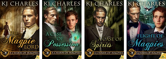
So far the cover I had to do the most work on was KJ Charles' Flight of Magpies.


Here are all the stock photos that went into it:


They also took a wee bit of manipulation. For example, the street in the middle left has the right overall look, it could even be from the Victorian era, but it's far too colorful. If I left it so it would've dominated the whole cover. So I manipulated to create the effects of both aerial perspective and depth of field. This was done with multiple layers, Gaussian blur filter, gradient mask, hue/saturation adjustment layer, and selective shading. I also added the cobblestone effect from the other photo.

I'm possibly the most pleased about the street, but putting Stephen and Lord Crane together took at least twice as long. Aside from the obvious, there was also a lot of adding shadows, darkening, lightening, adjusting colors and saturation. But in the end they came together pretty well.

This is the point where I'm supposed to wrap things up and part some sort of wisdom. How about this: cut and paste responsibly. Oh, and put some elbow grease into it. Look up how others did it, look at book covers, movie posters, paintings, illustrations, advertising graphics, etc.

And for closing, don't they look good together?