Last time I blathered on about depth of field and how it
helps to make the subject of an image to stand out from the background. Today I
want to bring up something else that does the same.

(Madonna of the Yarnwinder
by De Vinci)
aerial
perspective
noun Art
the technique of representing more
distant objects as fainter and more blue.
This is a real thing, not just something painters made up to
mess with our heads. Hike up to the top of a mountain, look around, and will see
something like this:

See how the mountains get fainter and less defined the
farther away they are? This effect is caused by our very atmosphere scattering
the light. With distance contrast and saturation decreases and everything
shifts toward a single color. Not necessarily blue—it depends on the time of
day.

The photo sliced from previous post's Pride and Prejudice poster was most likely shot early morning and
consequently the background has a warm yellow tint. Here are some more movie
posters making it work:

I often take inspiration from movie posters because a whole
lot of work have gone into them, and they are designed to work both on
billboards and as thumbnail size on Netflix. Sadly, I don't have their
designer's budget and super-high resolution photos of places and people. I have
to make do with stock photos and that's a challenge in itself.
I prefer not to create my cover models using the
Frankenstein method, but sometimes it's unavoidable, especially in case
historical novels. It's hard enough
to find a model wearing the right outfit, it's next to impossible to find one
who also has the right look. The good thing about those old time clothes that
high collars and cravats make head-swapping easier.
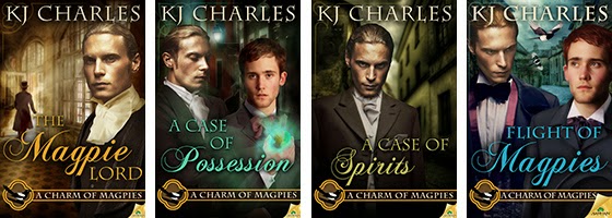
So far the cover I had to do the most work on was KJ
Charles' Flight of Magpies.

Here are all the stock photos that went into it:

They also took a wee bit of manipulation. For example, the
street in the middle left has the right overall look, it could even be from the
Victorian era, but it's far too colorful. If I left it so it would've dominated
the whole cover. So I manipulated to create the effects of both aerial
perspective and depth of field. This was done with multiple layers, Gaussian
blur filter, gradient mask, hue/saturation adjustment layer, and selective
shading. I also added the cobblestone effect from the other photo.
I'm possibly the most pleased about the street, but putting
Stephen and Lord Crane together took at least twice as long. Aside from the
obvious, there was also a lot of adding shadows, darkening, lightening,
adjusting colors and saturation. But in the end they came together pretty well.
This is the point where I'm supposed to wrap things up and
part some sort of wisdom. How about this: cut and paste responsibly. Oh, and
put some elbow grease into it. Look up how others did it, look at book covers,
movie posters, paintings, illustrations, advertising graphics, etc.
And for closing, don't they look good together?