zephyr |ˈzefər|noun1 poetic/literary a soft gentle breeze.2 historical a fine cotton gingham.• a very light article of clothing.ORIGIN late Old English zefferus, denoting a personification of the west wind, via Latin from Greekzephuros ‘(god of) the west wind.’ Sense 1 datesfrom the late 17th cent.
To me it sounds more like the name of a semi-precious gem.
Lou Harper's Blog
Wednesday, April 30, 2014
Tuesday, April 29, 2014
Desert Wind
The Santa Ana winds are blowing today and the high temperatures are in the nineties. Times like this always make me think of Raymond Chandler.
“There was a desert wind blowing that night. It was one of
those hot dry Santa Anas that come down through the mountain passes and curl
your hair and make your nerves jump and your skin itch. On nights like that
every booze party ends in a fight. Meek little wives feel the edge of the
carving knife and study their husbands' necks. Anything can happen. You can
even get a full glass of beer at a cocktail lounge.”
― Raymond Chandler, Red
Wind: A Collection of Short Stories
One of my novellas, Dead in L.A. features the Santa Anas. In the book they increase Leander's psychic abilities.
Monday, April 28, 2014
Vintage Monday: Swimsuit Edition

Apparently in the last half a century or so women's swimsuits got smaller, men's bigger. Is this the manifestation of cosmic balance as applied to stretchy fabric, or did men grow shy?
Friday, April 25, 2014
Cut & Paste – Part 2
Last time I blathered on about depth of field and how it
helps to make the subject of an image to stand out from the background. Today I
want to bring up something else that does the same.

(Madonna of the Yarnwinder
by De Vinci)
aerial
perspective
noun Art
the technique of representing more
distant objects as fainter and more blue.
This is a real thing, not just something painters made up to
mess with our heads. Hike up to the top of a mountain, look around, and will see
something like this:

See how the mountains get fainter and less defined the
farther away they are? This effect is caused by our very atmosphere scattering
the light. With distance contrast and saturation decreases and everything
shifts toward a single color. Not necessarily blue—it depends on the time of
day.

The photo sliced from previous post's Pride and Prejudice poster was most likely shot early morning and
consequently the background has a warm yellow tint. Here are some more movie
posters making it work:

I often take inspiration from movie posters because a whole
lot of work have gone into them, and they are designed to work both on
billboards and as thumbnail size on Netflix. Sadly, I don't have their
designer's budget and super-high resolution photos of places and people. I have
to make do with stock photos and that's a challenge in itself.
I prefer not to create my cover models using the
Frankenstein method, but sometimes it's unavoidable, especially in case
historical novels. It's hard enough
to find a model wearing the right outfit, it's next to impossible to find one
who also has the right look. The good thing about those old time clothes that
high collars and cravats make head-swapping easier.
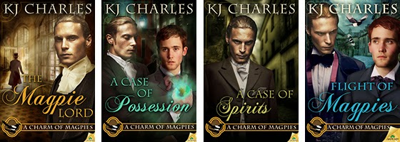
So far the cover I had to do the most work on was KJ
Charles' Flight of Magpies.

Here are all the stock photos that went into it:

They also took a wee bit of manipulation. For example, the
street in the middle left has the right overall look, it could even be from the
Victorian era, but it's far too colorful. If I left it so it would've dominated
the whole cover. So I manipulated to create the effects of both aerial
perspective and depth of field. This was done with multiple layers, Gaussian
blur filter, gradient mask, hue/saturation adjustment layer, and selective
shading. I also added the cobblestone effect from the other photo.
I'm possibly the most pleased about the street, but putting
Stephen and Lord Crane together took at least twice as long. Aside from the
obvious, there was also a lot of adding shadows, darkening, lightening,
adjusting colors and saturation. But in the end they came together pretty well.
This is the point where I'm supposed to wrap things up and
part some sort of wisdom. How about this: cut and paste responsibly. Oh, and
put some elbow grease into it. Look up how others did it, look at book covers,
movie posters, paintings, illustrations, advertising graphics, etc.
And for closing, don't they look good together?
Thursday, April 24, 2014
Cut & Paste – Part 1
Jordan Castillo Price used to post Photoshop insights on her
blog, but unfortunately she hasn't in a while. I miss them. Recently I read a
complaint about the quality of cut-and-paste in book covers, and it reminded me
how often I look at a cover and think: this could be so much better with a
little extra effort.
Even in the case of a very basic cover, consisting of a
single image, you can improve upon that image in Photoshop. Choice and
treatment of fonts make a big difference too.
When you put two or more images together, things get ever
more complicated with every additional element. You have a pile of stock photos
taken by different photographers, using different lenses, different angles, under
different light conditions, etc. You need to make them look like they belong
together, and also be representative of the story. You can achieve a lot by
simply adjusting brightness, contras, hue, saturation, colors, and the
occasional filter. For example, take this cover of mine for a Cat Grant novel:

To the left is the original stock photo, to the right is the
finished cover. The change of hue/saturation and contrast upped the drama.
Removing the overly busy background helped too. The story is centered around a
gym, but it's already obvious from the subtitle, so I didn't try to crowd its
graphic representation into the background. The out of focus suggestion of a window
works much better.
One of my pet peeves is when there's a person or a couple on
the cover, and a deep background behind them but everything is in focus and has
the same tonal values. It's busy, lacks depth and makes me sad. Compare these
two covers (neither are mine):

The second one is far more pleasing to look at, and not only
because of the lack of the eye-searing yellow and hideous font. In the second
cover there is a sense of space.
In photography there's this thing called depth of field.
depth of field
noun
the distance between the nearest
and the furthest objects that give an image judged to be in focus in a camera.

(photos borrowed from
WikiCommons)
The photo on the left has a shallow depth of field and it
makes the flowers stand out. The big depth of field on the right makes the
flowers disappear into the busy background. The human eye doesn't see
everything in focus either, it's our brain making it seem so. When it comes to
photographs—or book covers—our attention is drawn to the thing in focus. We
know it's important. Having everything in focus is like having every sentence
end with an exclamation mark! It's confusing! And annoying! See what I did
there?
Here are a few movie posters that made good use of shallow depth
of field:

It works making the characters prominent, doesn't it?
Wednesday, April 23, 2014
But I Don't Like Spam!

An obnoxious email message hawking porn keeps showing up in
my mailbox. The subject is always a different gibberish and the body is done
with Java or something so the text in it not really text (not an image either).
I've set up a dozen filters but it keeps sneaking through.

And it made me wonder: is there a payoff for un-blockable
spam? Can you annoy others into clicking your link, buying your product? Are
there people out there who after deleting a 100 of these, look at the 101st and
go "hm, maybe this is what I wanted all my life?" It must work or the
senders wouldn't bother. Right?
spam |spam|
noun
1 ( Spam) trademark a canned meat
product made mainly from ham.
2 irrelevant or inappropriate
messages sent on the Internet to a large number of recipients.
verb [ trans. ]
send the same message
indiscriminately to (large numbers of recipients) on the Internet.
DERIVATIVES
spammer noun
ORIGIN 1930s: apparently from
sp(iced h)am.
Too often author promo reminds me of spam. You accept
someone's friend request and suddenly his/her latest release takes over your
newsfeed. I don't want to sound like an asshole—being excited about a new
cover, new book, a certain review is normal. I'll like it, share it, etc. Possibly. However, when it's post after
post and day after day, I get grumpy and find a way to remove the author from
my newsfeed for good.

Sadly, I understand the desperation behind these tactics.
Promo is the bane of every author's existence. No matter if you're a newbie or
well established, you have a nagging feeling there are readers out there who'd just
love your book, if only they knew about it.
Being an author is a lot like fishing: you throw your book out
there and hope someone will bite. The author's role is reactive. Or at least it
used to be. On Goodreads you can
take a more active role—you go the right group and friend everyone there. I
don't know how others feel about this, but when it's done to me it rubs me the
wrong way. I bristle at the idea of becoming someone's fan fodder.
Deep down I suspect going aggressively after reader must
have a payoff somewhere. You cast a wide net, you catch fish. It still feels
wrong to me. With a new book
coming out in a couple of months I sure wish I knew the secret of perfect
promo, the golden road between spam and tofu. Alas, I don't.
Tuesday, April 22, 2014
A Good Deal

All Romance eBooks is having a 50% off Earth Day extravaganza. Check it out. Is that a good deal or what? My other books are half off too, except the free ones. Those are still free.
Monday, April 21, 2014
Vintage Monday: Ladies Too

Another Pinterest find: an illustration of sapphic love and amazing coiffure. I can't imagine how long it must take create those hairdos every morning. No wonder people needed servants.
Wednesday, April 16, 2014
Wednesday Word: Badinage

nounhumorous or witty conversation : cultured badinage about art and life.ORIGIN mid 17th cent.: from French, from badiner‘to joke,’ from badin ‘fool,’ based on Provençal badar‘gape.’
It's seems like half the English words are French. WTF is up with that? I understand when it comes to culinary terms, because the French are a bunch of hedonists and epicures.
Monday, April 14, 2014
Vintage Monday: The Odd Ones

This is one of the more peculiar vintage photos I've discovered on Pinterest. That place is like quicksand for a visual hoarder like myself. It has a wonderfully clean interface, simple but easy to use search, and the option to both link and upload images. When you search one image leads to another till you've killed hours.
I've set up my own boards, covering subjects from food to
street art, and I have them for my books too. Being rather visual, I tend to
look up pictorial references for all sorts of stuff as I write, even if thing
is question only appears for a few lines. Like the steampunk wristwatch that
plays minor role in Spirit Sanguine.
In the old days I kept the images in folders on my desktop, later in folders
within Scrivener. Now I put them on Pinterest too, keeping the board private
till the book's release day.
I have no idea how many readers actually look at the images
I've put up to illustrate my stories. The Dead
in L.A. board has a photo of the lookout spot in Griffith Park where Jon
and Leander have a conversation, and the Dead
in the Desert one has pictures of the library in the desert where Leander
make an important discovery. They are both real places, even if the characters
and events are fictional.
Now excuse me, I have important "research" to do.

Wednesday, April 9, 2014
Wednesday Word: Jigger
According to my other dictionary, "I'll be jiggered" is a British expression. I've sure never heard it before yesterday—from Charlie Cochrane. Brits have the awesomest expressions. I want to steal them all. And sometimes I do—my poor editor keeps asking if I'm intentionally making my characters sound British.
Monday, April 7, 2014
Vintage Monday: On the Beach

Cyanotype is a photographic process going back to the 19th century. It's original purpose was to create technical drawings, and as far as I know it is the origin of the "blueprint."
Wednesday, April 2, 2014
Wednesday Word: Aslant

aslant |əˈslant|adverbat an angle or in a sloping direction : some of the paintings hung aslant.prepositionacross at an angle or in a sloping direction : rays of light fell aslant a door.
A simple word, yet seldom used.
Subscribe to:
Posts (Atom)